Devfic Brand Guidelines
Resources to use the Devfic name, logo, and color the right way.
Naming
Write it as Devfic — one word, capital “D”. Don’t stylize it as DEVFIC, DevFic, or “Dev fic” in public materials.
Usage
Keep clear space around logos and wordmarks. Don’t stretch, recolor, or crop the mark in a way that changes how it reads.
Devfic Wordmark
Prefer the wordmark whenever there is enough space. It carries the strongest recognition for Devfic.

Devfic Wordmark — on dark
Default for the website and dark backgrounds.

Devfic Wordmark — on light
Use on light backgrounds and print materials.
Devfic Logo
Use the logo mark in compact layouts where the full wordmark is too wide.
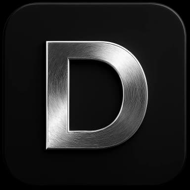
Devfic Logo — on dark
Default mark for dark backgrounds and compact layouts.
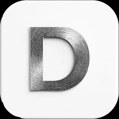
Devfic Logo — on light
Use on light backgrounds and print materials.
Devfic Icon
For avatars, favicons, and small UI — keep it in a rounded square with a soft corner radius.
Devfic Icon — on dark
Default for avatars, favicons, and small UI on dark surfaces.
Devfic Icon — on light
Use for light backgrounds, app stores, and light UI chrome.
Colors
Two colors pulled from the marks: Vivid Cerulean from the wordmark dots, and Silver from the 3D logo metal. Everything else stays black and white.
Vivid Cerulean
RGB 0, 162, 232
Accent dots in the wordmark — buttons, links, and highlights
Silver
RGB 216, 216, 216
Metallic tone from the 3D logo mark — highlights and soft UI chrome
Need help with usage ?
Questions about the brand or a custom format — reach out anytime.